画面右下にふわっと現れる丸いボタン。
モバイルUIではよく見かけるパターンです。
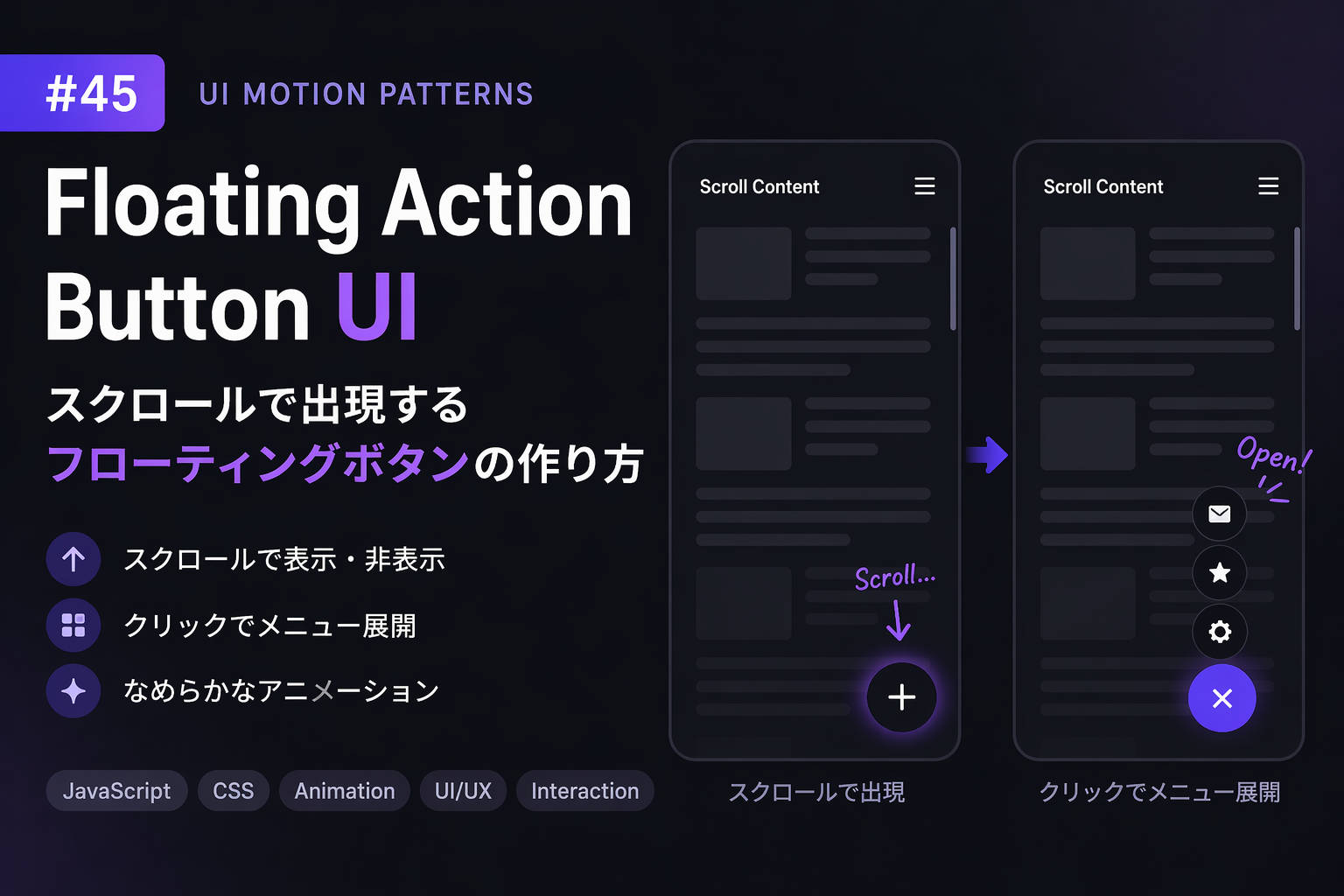
この記事では、
- スクロールで表示/非表示
- クリックでメニュー展開
- なめらかなアニメーション
をまとめて実装します。
1.実装コード
HTML
<div class="fab-container">
  <button class="fab" id="fab">+</button>

  <div class="fab-menu" id="fabMenu">
    <button>✉️</button>
    <button>⭐</button>
    <button>⚙️</button>
  </div>
</div>
CSS
body {
  height: 200vh;
  margin: 0;
  font-family: sans-serif;
}

/* container */
.fab-container {
  position: fixed;
  right: 20px;
  bottom: 20px;
}

/* main button */
.fab {
  width: 56px;
  height: 56px;
  border-radius: 50%;
  border: none;
  background: #111;
  color: #fff;
  font-size: 24px;
  cursor: pointer;

  transform: scale(0);
  opacity: 0;

  transition: transform 0.3s ease, opacity 0.3s ease;
}

/* visible */
.fab.show {
  transform: scale(1);
  opacity: 1;
}

/* menu */
.fab-menu {
  display: flex;
  flex-direction: column;
  align-items: center;
  gap: 10px;
  margin-bottom: 10px;

  transform: translateY(20px);
  opacity: 0;
  pointer-events: none;

  transition: 0.3s;
}

.fab-menu.open {
  transform: translateY(0);
  opacity: 1;
  pointer-events: auto;
}

.fab-menu button {
  width: 40px;
  height: 40px;
  border-radius: 50%;
  border: none;
  background: #333;
  color: white;
  cursor: pointer;
}
JavaScript
const fab = document.getElementById("fab");
const menu = document.getElementById("fabMenu");

let lastScroll = 0;

/* scroll show/hide */
window.addEventListener("scroll", () => {
  const currentScroll = window.scrollY;

  if (currentScroll > lastScroll && currentScroll > 100) {
    fab.classList.add("show");
  } else {
    fab.classList.remove("show");
    menu.classList.remove("open");
  }

  lastScroll = currentScroll;
});

/* click expand */
fab.addEventListener("click", () => {
  menu.classList.toggle("open");

  fab.textContent = menu.classList.contains("open") ? "×" : "+";
});
2.ポイント解説
① スクロール検知
window.scrollYスクロール方向を判定して
「下スクロール時のみ表示」にしています。
👉 フレームレート記事と相性◎
② 表示アニメーション
transform: scale()
opacity
この2つを組み合わせると自然になります。
👉 easing の理解がここで効く
③ メニュー展開
classList.toggle("open")状態管理をシンプルにしています。
👉 状態管理に接続できる
3.実験:フローティングボタンの動作確認
スクロールとボタン操作を試してみてください。
観察ポイント
- 出現タイミングは自然か?
- ボタンのサイズは押しやすいか?
- メニュー展開の速度は適切か?
4.よくある失敗
- 表示タイミングが早すぎる
- モバイルで押しにくいサイズ
- アニメーションが硬い(easing未調整)
5.まとめ
Floating Action Buttonは、
- 重要アクションを強調できる
- モバイルUIとの相性が良い
- アニメーションで体験が変わる
非常に実用性の高いUIです。
コメントを残す